UI/UX Case STUDY: Performing design review on leovegas.com mobile signup flow
1.1 Design Review
Overview
Sign up flows are one of the first encounter your potential customers have with your product. Aside the fact that first impressions are crucial, it makes a lot of sense to make sign up flows as frictionless as possible, for a better user experience.A good sign up flow aims to collect data from users in a way that feels natural and gives them a feeling of getting something in return.
As much as "patience is a great virtue", people are still in a hurry. And when a product sign up flow don't meet up with their pace they get bored 😴 🥱
Problems
The design and dev team at LeoVegas have done credibly well in putting up these awesome digital products. But to double the coolness, I have few things to add;1. The LeoVegas website looks good, the sign up process is cool too but I find it difficult signing in first, because I didn't see a prompt call-to-action button instructing me to sign in as a visitor, instead I saw PLAY.
2. Sign up process is too long. - too many words on the sign up process.
3. CONTACT US option on the sign up page not necessary.
4. No error screen for when a user is trying to sign up from restricted locations.
5. “No, I do not wish to receive any LeoVegas bonuses, promotions, news or other marketing information through email, SMS or phone” seems off.
1.2 Sign up flow
Solution
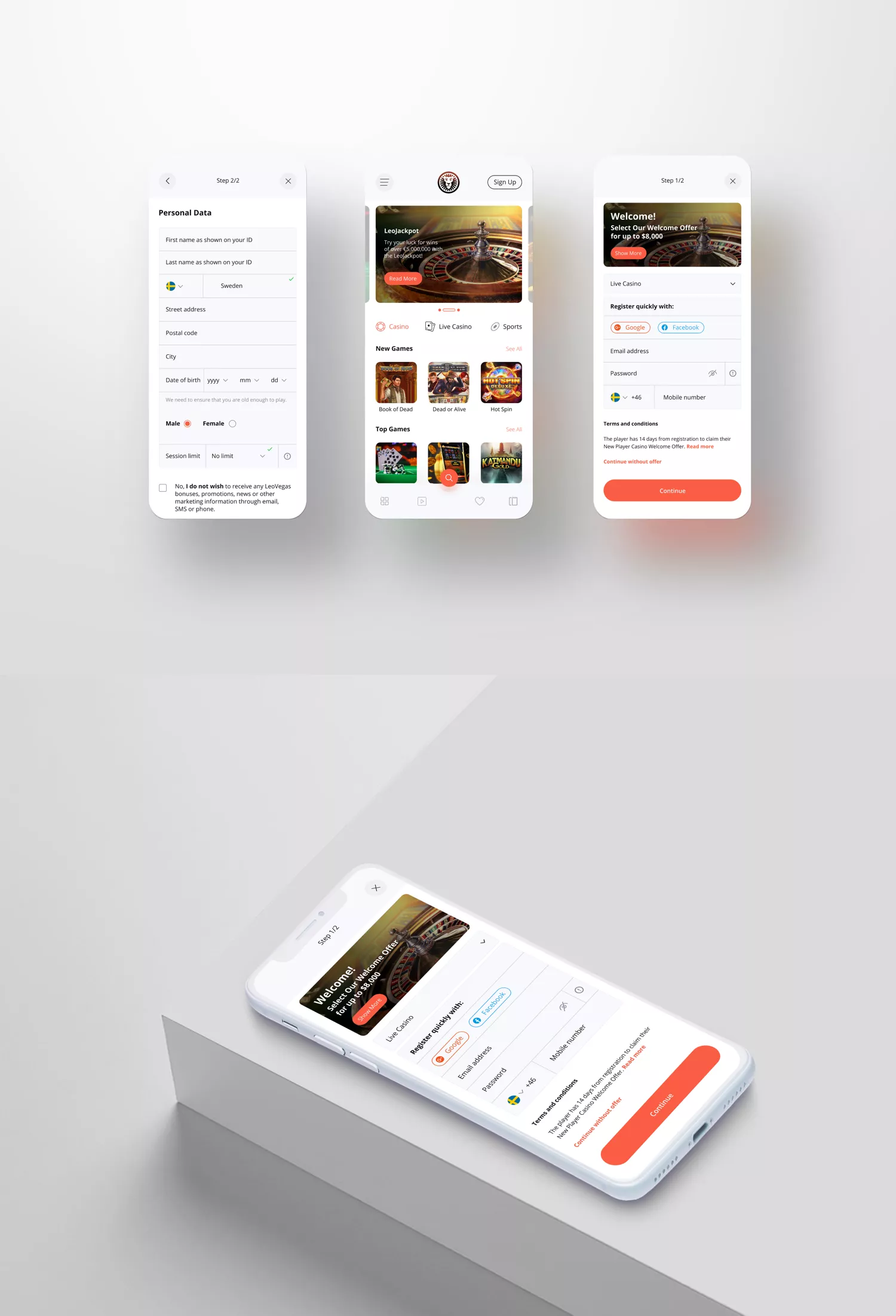
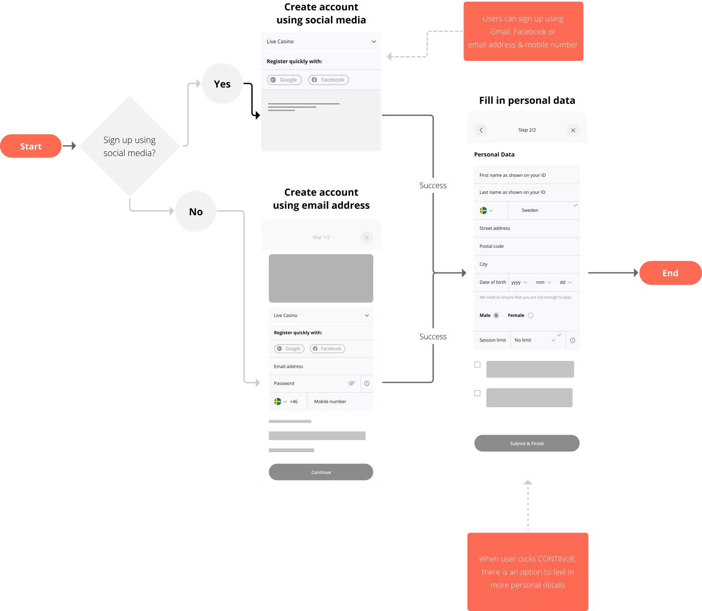
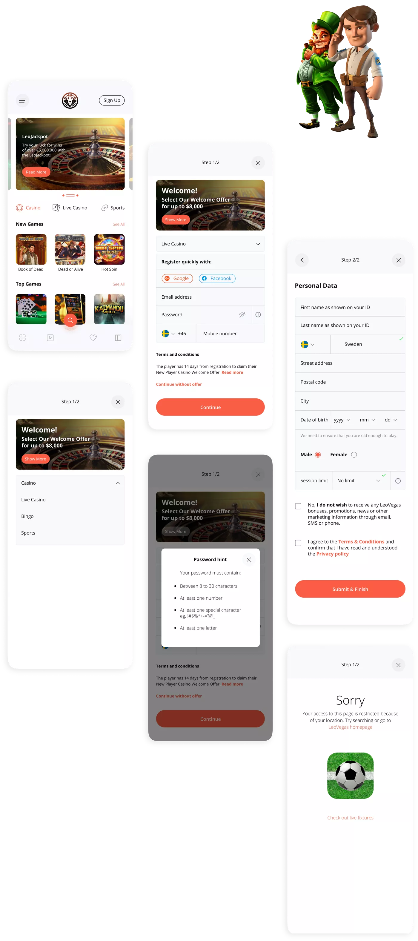
1. Redesigned the homepage to add SIGN UP button instead of PLAY. To add to this, I redesigned the homepage because of a “bounce” report I got from a user. She said “when I entered the website I just got out”, insinuating that the homepage was clumsy.2. Noticed there are 3-step processes to sign up. Some users wouldn’t be that patient to carry out all steps, especially when the first sign up page talks more about bonuses and don’t get you to the main reason why you choose to sign up.
So, had to reduce the waiting time for the sign up process by fusing the processes to just 2 screens. The bonus page is not lost, I creatively added it to the 2 page sign up process. The idea is to increase speed in sign up process or, create an illusion of speed. Also, there are too many words to read, almost across all screens. I had suggest there should be more shared understanding and less documentation.
3. The CONTACT US button is not necessary, why because there isn’t any need for users to contact the company yet because the sign up process shouldn’t be tedious. CONTACT US button creates panic and gives the impression that something is going wrong already from signing up which is supposed to be a simple process. This button can be on a different page.
4. Noticed I couldn’t sign up on leovegas.com until I used a vpn. The sign up page didn’t give a response to that, it just keeps glitching. I thought it that a user should be informed about location rules in a most polite manner, plus there should be conscious efforts to tangibly distract a user from the disappointment of not being able to sign up. I made that possible by directing users to “check out live fixtures”
5. LeoVegas is data driven, there should be concious call-to-action to collect users as subscribers, and then regular customers. So I would suggest the current phrase should be rephrased to “YES, I wish to receive LeoVegas bonuses, promotions, news or other marketing information through email, SMS or phone”. Users unconsciously clicking the blue tick helps LeoVegas give users more information about the company. If users make efforts to deactivate the emails being sent to them by LeoVegas then they really don’t want to receive any information or bonuses.
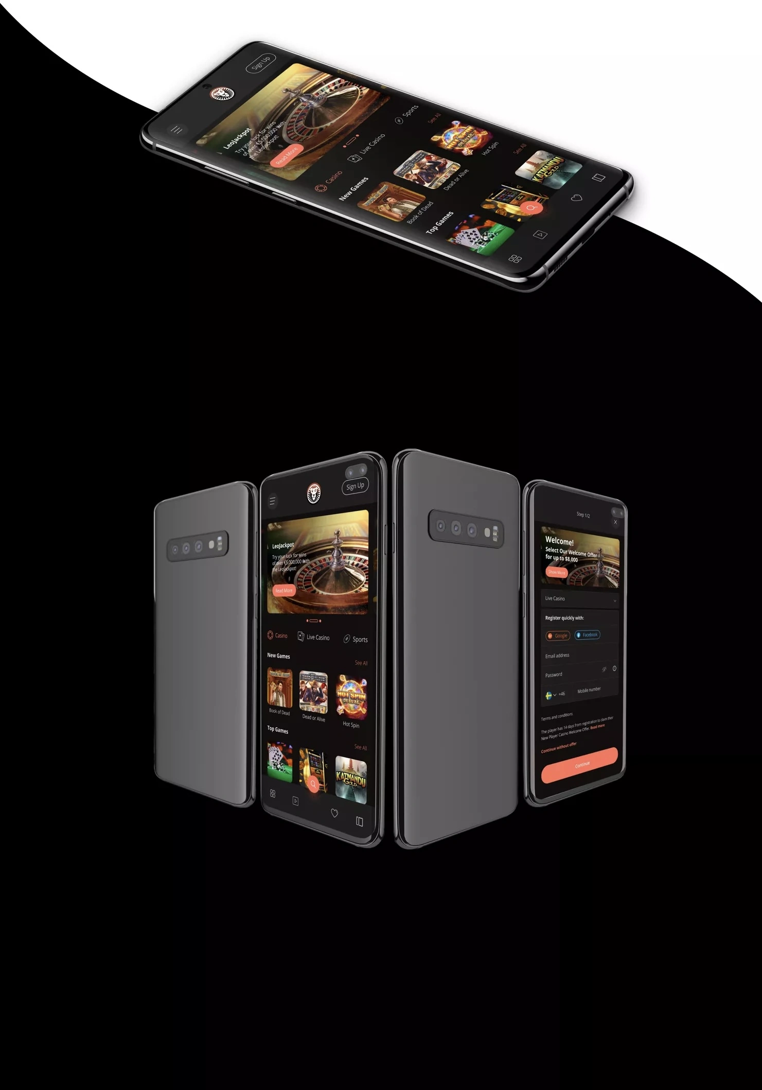
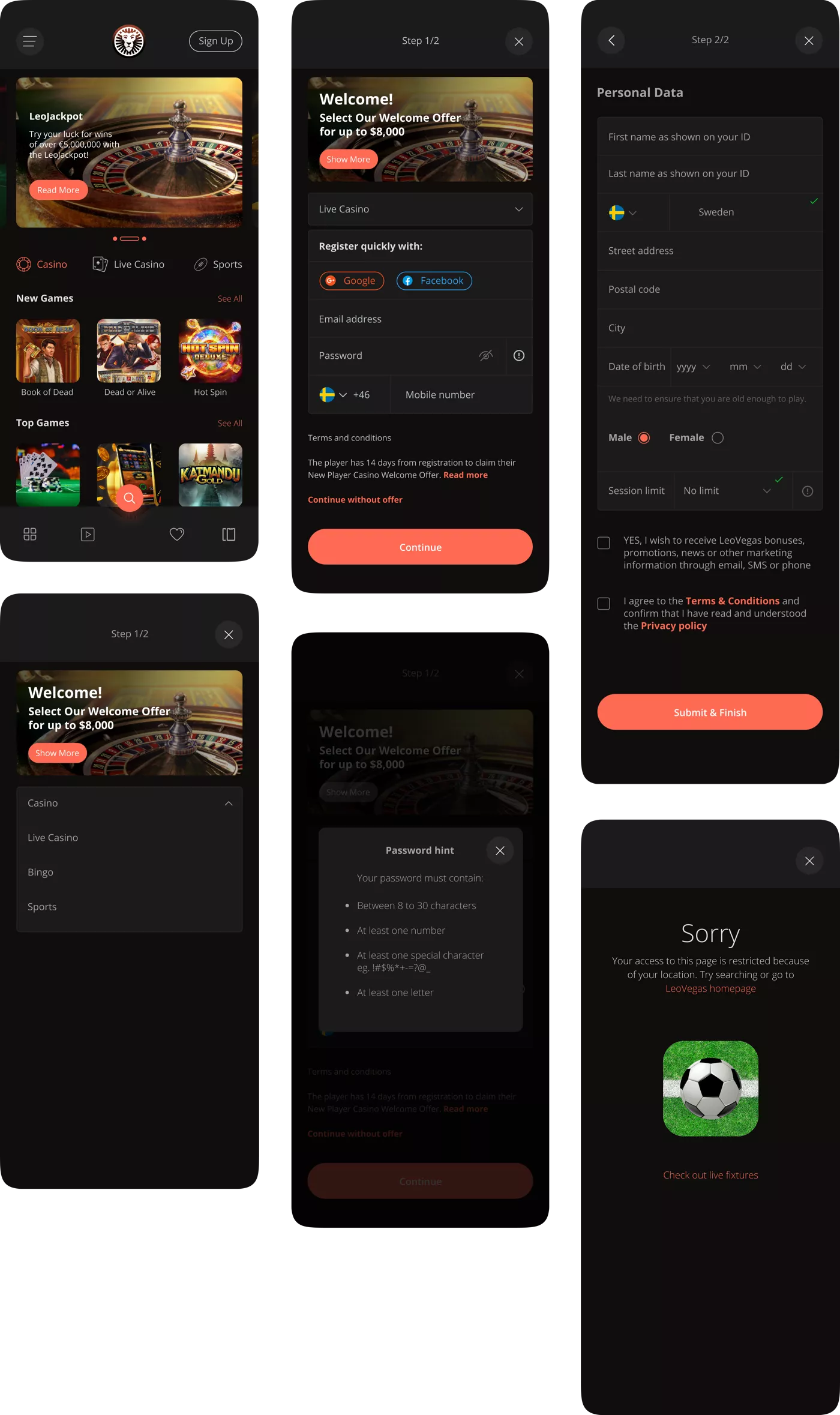
Extra; I added dark theme as option for users who are not comfortable using light theme. One of the advantages is to reduce blue light exposure and help with eye strain that comes with prolonged screen time.
1.3 Field Validation
Hi-Fi design suggestion - Light theme
Hi-Fi design suggestion - Dark theme
Design Approach
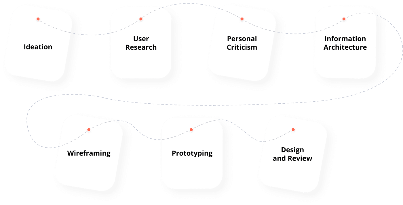
I understand the most important step in design process which
is Empathy. Whether I am to criticise an existing project or
come up with new ideas, I had the user in mind all along.

Information required to perform better task
what is the bounce rate on leovegas.com current sign up page ?
what are the most reported issues concerning the sign up process ?
What is the current exit rate on the sign up page and exit point too ?
Further research activities
A/B Testing: to generate quantitative, behavioral data; and to understand what users will do when they successfully sign up on the new design.Wish I engaged more people, because more feedbacks translates to better informed decisions. Also, recently learned of usertesting.com , wish I knew them earlier or had more time to know more about their services. They have a team of professionals that helps to UI/UX and Product designers learn more about improving customer experience.
KPIs to track changes
Average Time on Page
Users have a defined intention in mind visiting a sign up page. I made sure the process is easy and flawless, so that users wont have the need to spend much time trying to get the website to accept them. There are lots of goodies Leovegas has to offer and user shouldn't be kept waiting.Visual designs
